Last week, I shared some lessons learned from a Domino Data Science Pop-up that I attended a…
Data / AI / ML
Last month, we released our startup guide. We appreciate all the feedback and we’ll be adding to the handbook over time so that it can be a more comprehensive source. So, please keep sending us your thoughts and suggestions. One topic that I’m excited to dig into deeper is KPIs / metrics. I recently caught […]
Last week, I shared some lessons learned from a Domino Data Science Pop-up that I attended a…
I’m fascinated by the Open Data movement, particularly when it comes to government where the…
Last month, we released our startup guide. We appreciate all the feedback and we’ll be adding to the handbook over time so that it can be a more comprehensive source. So, please keep sending us your thoughts and suggestions.
One topic that I’m excited to dig into deeper is KPIs / metrics.
I recently caught up with our good friend George Psiharis, who is the Chief Operating Officer at Clio (which is building the operating system for lawyers and raised $333M last year). He shared some simple but effective frameworks that he has used at the company to understand the business while it’s in flight.
Specifically, one approach is applying Kaplan-Meier (KM) curves to see how trailing metrics like conversion rates are trending over time vs. waiting for a fixed period (60, 90, 120 days etc.) to see if something is improving.
Here’s a great explanation of Kaplan-Meier curves from George:
For trending charts and KM curves (also referred to as survival analysis), we made this switch that seems small but is actually fundamental to the way we look at our business.
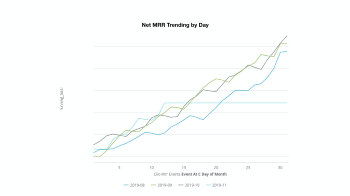
The first example is looking at our in flight metrics (e.g. Net New MRR, redacted scale below) by day of month and comparing to other periods. Instead of waiting for something to happen or for month-end (especially for a transactional monthly business like ours), we can see how we are trending while the period (e.g. month) is still in progress:

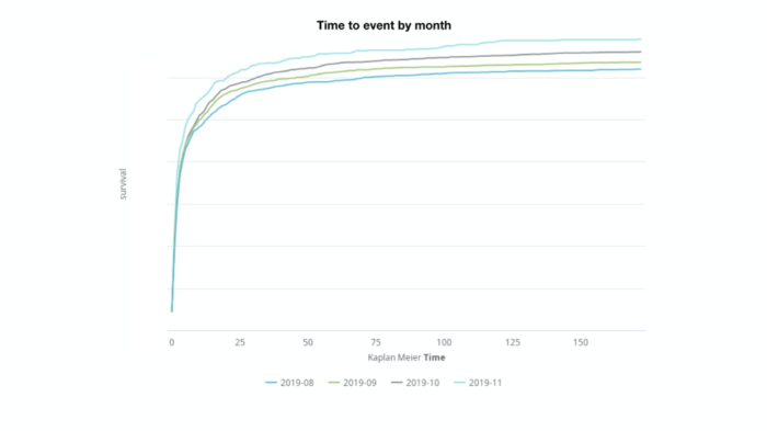
Another analysis tool we use often is the Kaplan-Meier curve. Using this lens, we can view conversion events as they accrue over time. Implemented in a specific way, these curves can show us how a conversion rate trends over time without waiting until the end of a fixed period of time. Sample use-cases could include visitor-to-lead conversion rates by day (this period versus previous period), or SAL-to-paid conversion rates by day up to 60 days by rep, and so on.

We use this to monitor all of the trailing conversion rates in our business, e.g. our closed-won rate for October is naturally lower than our closed-won rate from September, but we can use a KM curve to see how our records are converting by day in October compared to this time last month. We can also use this to look at things like time to first value in the product and time to churn. When we try improvements, we don’t need to wait as long to see if they correlate with impact we care about.
I’ve found that to be invaluable (if a bit obvious), especially in subscription SaaS where trailing rates are so important. It’s the kind of thing I wish someone had told me about sooner!
—
Hope that SaaS startups find KM curves to be a great shortcut tool. Do you have any other ways in which to evaluate your company in flight?
Fun Fact: George inspired me to host data “summits” over Google Hangouts with data science, engineering, product, and growth teams across the Version One portfolio. If you’re interested, here’s some learning from those hangouts: from data fragmentation/inconsistency to scaling data science in the organization, and how to manage your data.
Version One
Over the past 13+ years, we’ve written a lot on this blog — investment announcements, portfolio recaps, year-in-reviews. But a handful of posts have captured something deeper: the ideas and convictions that actually guide how we invest. If you’re a founder trying to understand what makes us tick, or just curious about how our thinking […]
Two weeks ago, Boris recapped our fund and portfolio activity in what has been a…
In recent posts, we've outlined our updated thesis around backing mission driven founders and explained…